
Oxalis Books
Brand Identity DesignOxalis is a children’s publishing company based and deeply rooted in the Pacific Northwest. Through unique stories that affirm the importance of community, play, and respect, Oxalis’ books help kids construct their identities, their understanding of the world, and their value systems.
Reid wanted an identity that felt charming, playful, and creative, and spoke directly to the weird humor that captures kids’ imaginations. The concept we chose is based on the distortion of the Oxalis “O,” which is drawn over to create “O Buddies.”
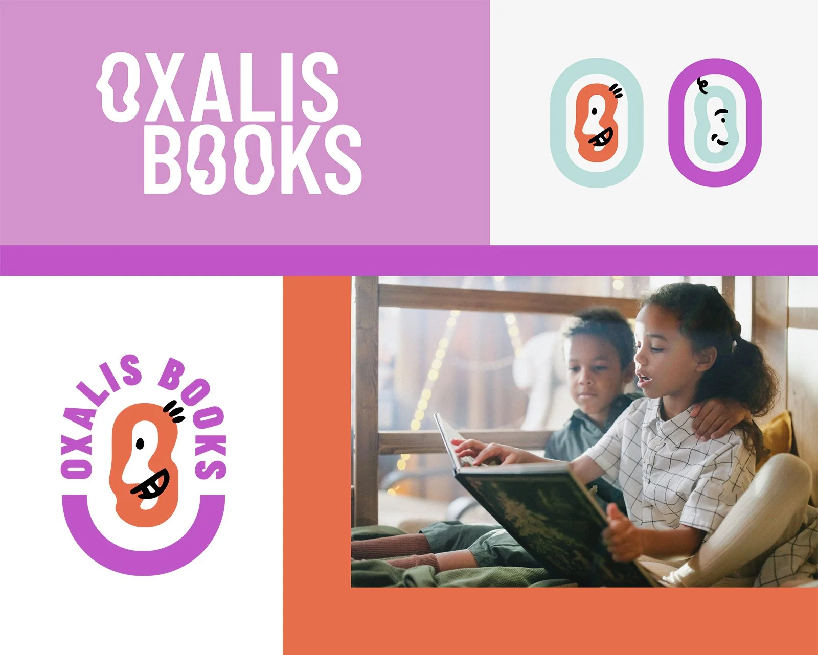
The dreamy “O” distortion and the playful faces combine to reference the simultaneously strange and fun world of a child’s imagination.

Since Oxalis may eventually move to incorporate more books for older readers, I had flexibility of concept at the front of my mind during this process. The “O Buddy” concept has this age-appeal flexibility — all kinds of things could be doodled on top of this “O,” beyond the little creatures. There’s also a lot of fun potential for extended branding with this concept — the doodles that make up the buddies could be applied to photographs, blocks of text, etc.
