
Nike Adventure Club
Branding Case Study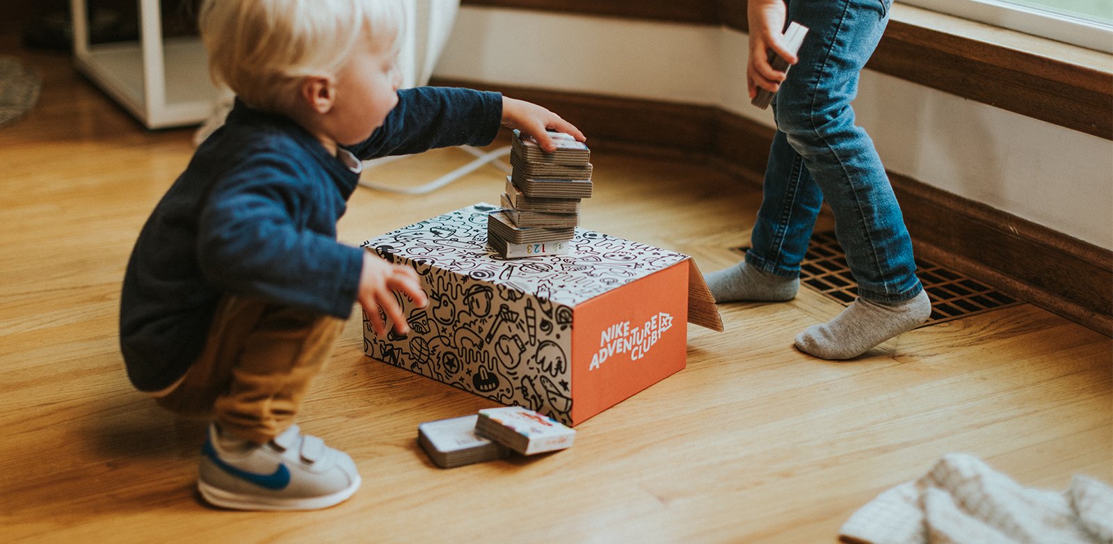
Design Problem
The original service — named EasyKicks with Nike — was a kids’ shoe subscription service backed by Nike, providing monthly, bimonthly, or quarterly deliveries of new shoes as kids wreck or outgrow their old ones. After two years refining the service mechanics, we needed a rebrand that would allow us to transition seamlessly into Nike.
We wanted a new name and visual identity that would expand our service beyond provision of shoes, identify us as part of the Nike ecosystem, and offer a unique point of view on the experience of childhood.
A New Name
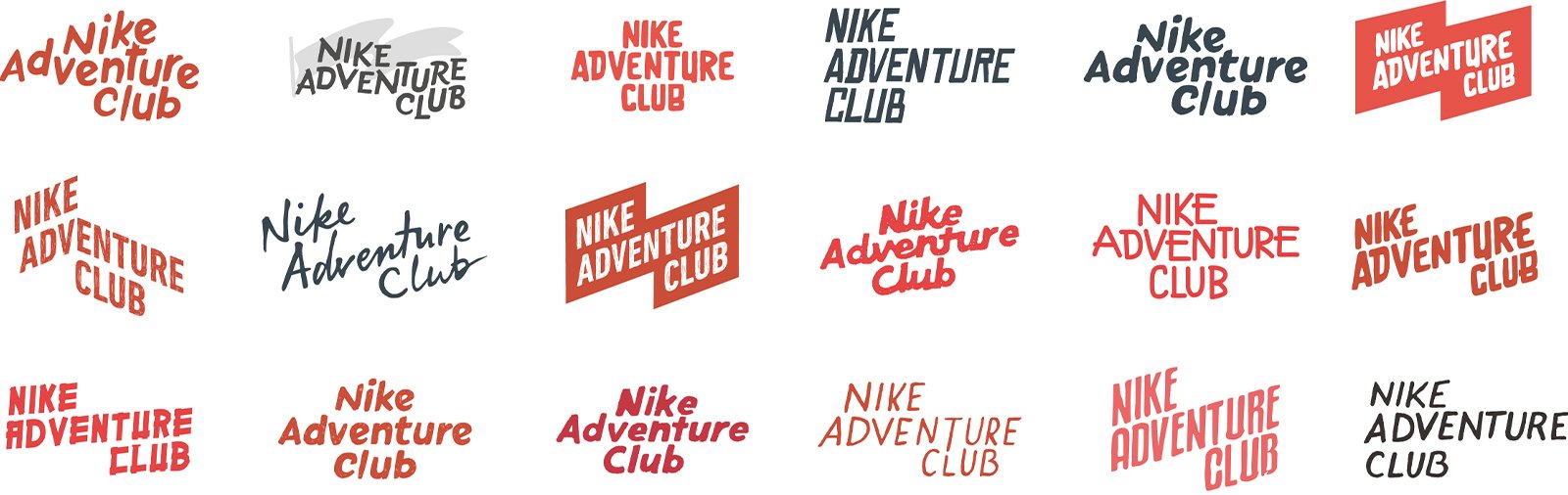
After multiple rounds of testing dozens of names, we landed on Nike Adventure Club as the new name of our service. The name spoke to the promise we wanted to make — that membership in this service would empower kids to explore, play, and seek adventure in the everyday.

A Point of View
Before beginning design, we spent time defining our brand story. We wanted to capture a childhood rough around the edges, lo-fi, gritty, authentic, and headstrong. What would happen, we wanted to know, if we celebrated those g-rated transgressions of youth — skipping naptime, licking the car window, or drawing on the wall — instead of scolding them?
We started with imagery and inspiration, collecting photography, ephemera, and design examples that hit the mood that we were aiming for. We paid attention to the ways that color, photo staging, line weight, typeface character, and written tone brought an image closer or farther from the attitude we wanted to capture.

Building a Brand
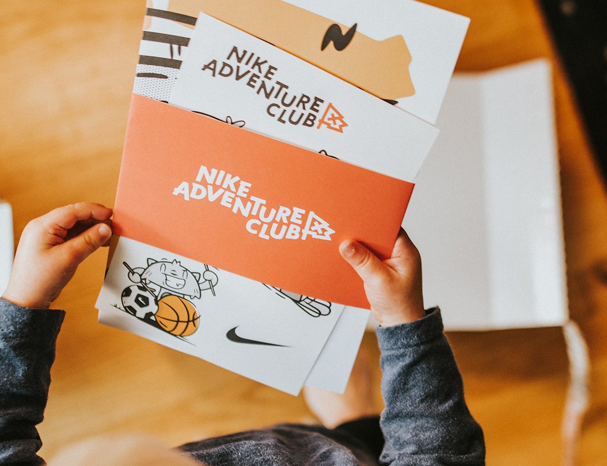
We spent weeks on logo ideation, sketching, and critiques. We wanted something imperfect and disheveled, possibly even to the point that a kid could have drawn it themselves. We all found ourselves focusing on wordmarks, since there’s so much rich area for imperfection in type. After settling on a favorite wordmark concept, characterized by a wandering baseline and messy, brush-like strokes, we refined and paired it with a mark — a flag, our symbol of determined kids boldly claiming a space for themselves.
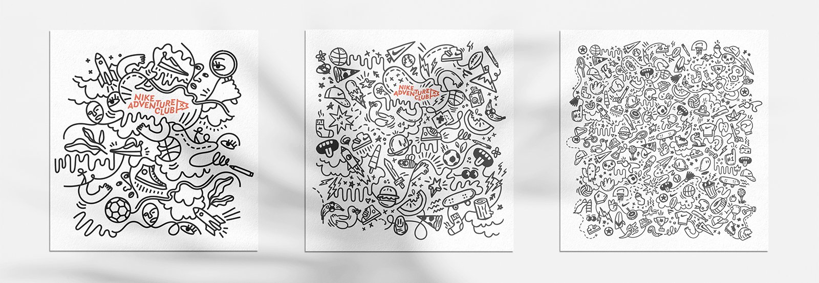
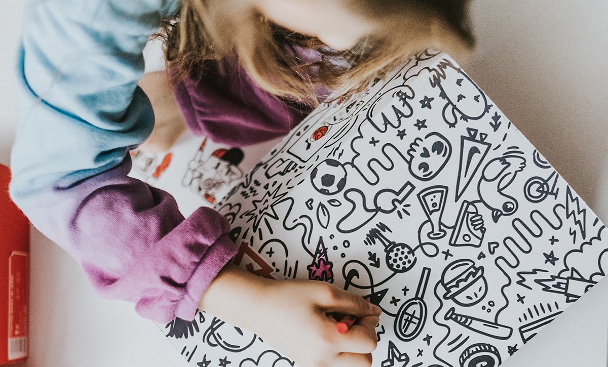
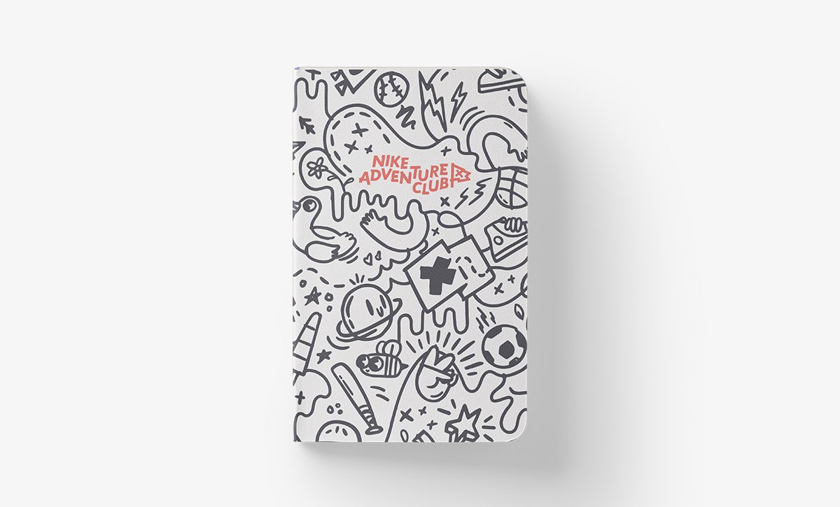
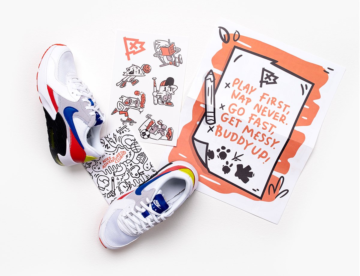
In the following months, we developed the brand by building elements around our story and our logo. Our central pattern, a carefree tangle of doodled lines, was inspired by composition notebooks and classroom margin drawings. This style of illustration is also featured throughout our brand as icons and expressive, gestural design elements.
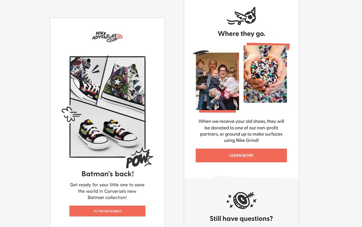
We developed a photo style that recalls worn scrapbook pages from long summer days, and our color palette (besides charcoal and white) was taken from the tones of fading light as adventurous kids are called to come in for the evening. Our main brand font, Greycliff, is classic, durable, and highly readable.
Before Nike Adventure Club, we’d had a large cast of continuously-refreshed characters to feature on stickers and site illustrations. With our rebrand, we instead created a smaller cast of characters that kids could recognize and start to identify with. They surface on only the most kid-facing parts of our brand (primarily the Adventure Guides), so we made them very kid-friendly — expressive, exaggerated, and goofy.
My Role
This re-brand was accomplished primarily by three people — myself, my creative director, and the lead brand designer on our team. Our UI designer and our asset manager joined as support, particularly in the early concepting phase.
Consequently, my design work and input really helped drive this process. I ideated, sketched, and constructed logos; I helped develop the brand story; I worked on other brand elements including patterns, color palettes, and illustrations; I synthesized and presented test results; and I designed various test collateral so we never lost sight of how our work-in-progress would look in action.
The Nike Adventure Club wordmark was developed from one of my concepts, and I was the chief designer for our pattern and other doodle elements.

Postscript
This project underscored the importance of a strong brand story.
With smaller clients, tighter budgets, and less time, I am typically limited to attributes when defining a brand: maybe a brand wants to feel vivid and striking without overwhelming the viewer; maybe there’s an origin story that we can tell effectively. But having the time to craft a point of view — childhood as a messy project full of mistakes, resistance, and muddy hair — that’s what allowed us to tell an effective, unified story and truly create all our brand elements towards that end.
Creative Direction: Chris Arth
Concepts: Chris Arth, Adam Shalz, Kat Black, Francisco Juarez, Sabrina Brubaker
Graphic Design and Illustration: Kat Black, Adam Shalz
UI Design: Francisco Juarez
Photography: Nash Howe / Brother PDX