
Nike Adventure Club
Print Adventure Guides Case Study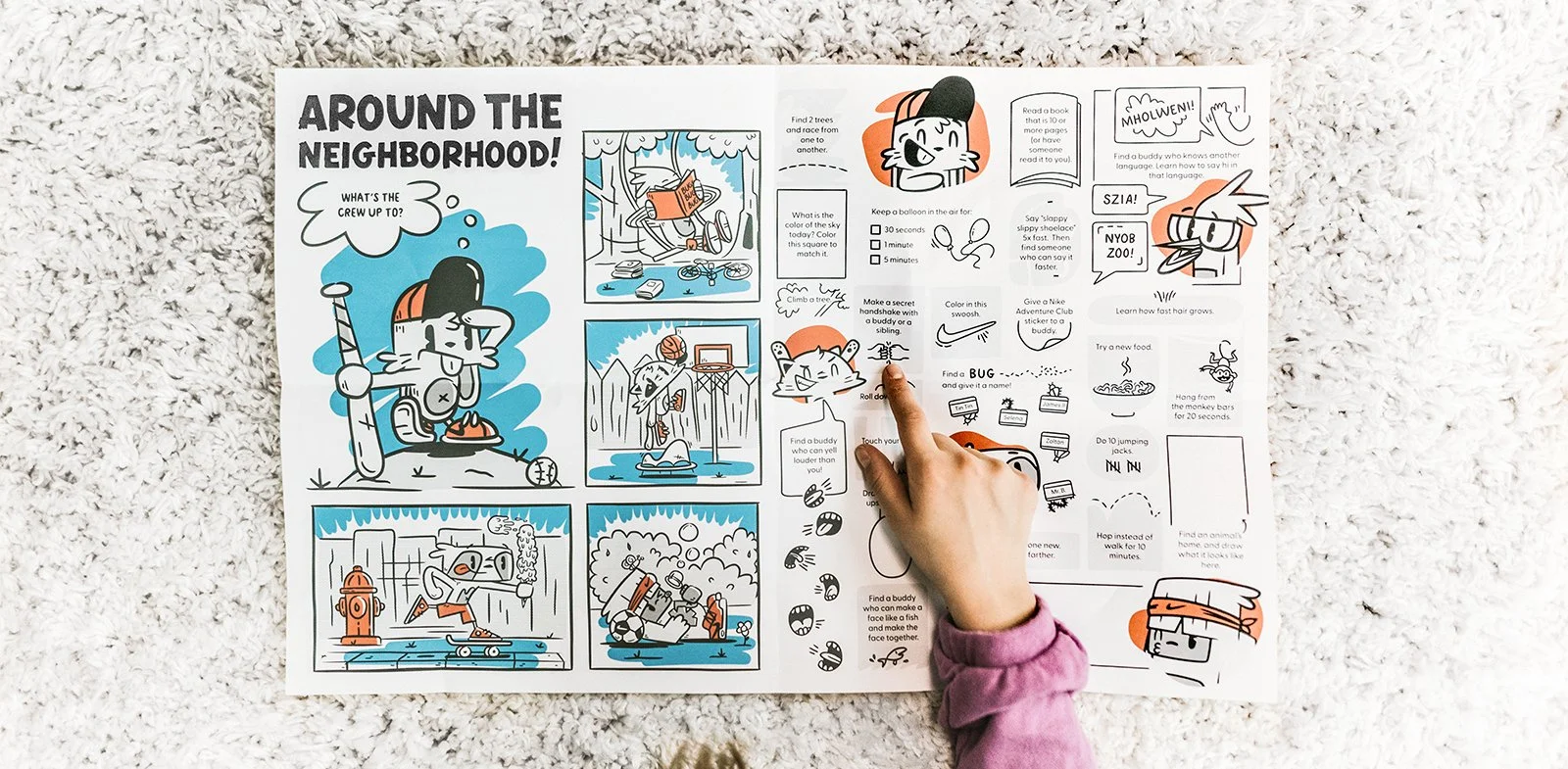
Design Problem
Nike Adventure Club was a kids’ shoe subscription service from Nike, providing monthly, bimonthly, or quarterly deliveries of new shoes as kids wreck or outgrow their old ones. We also championed childhood activity and exploration, working to find new ways to inspire kids to exercise both their muscles and their minds.
We wanted to create a resource that worked as both inspiration and tool for physical activity. It was also important to us that it not be solely digital — we wanted something kids could feel, own, collect, hide, and perhaps drag along, muddy and torn, on their adventures.
The Pilot Guide
Various teams within Nike Adventure Club came together to ideate and bring to life the first version of the Nike Adventure Guide — a paper-based activity guide full of ideas and instructions for physical games.
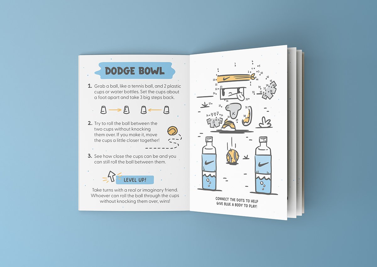
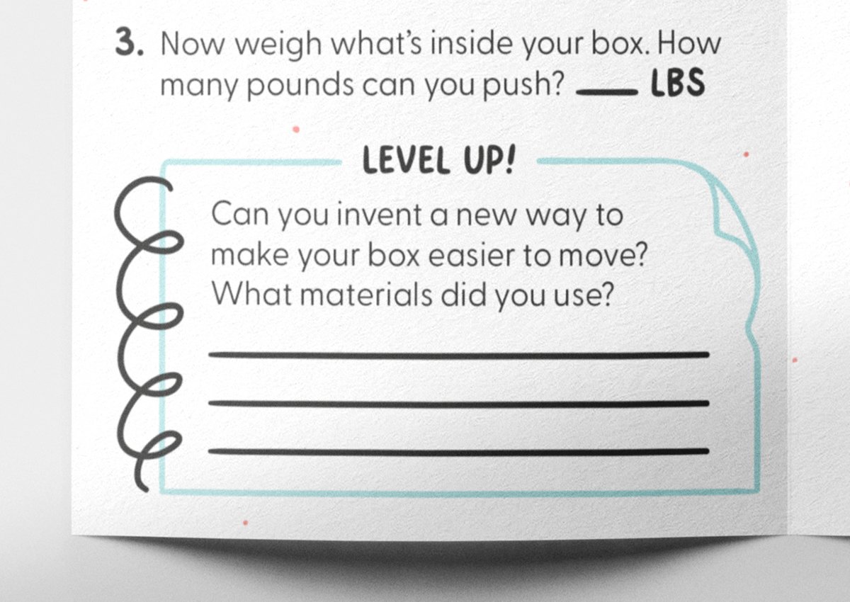
We landed quickly on a newspaper-sized foldable poster format. As a Nike enterprise, we felt it was important to place emphasis on physical activity and sport, widely-defined, so instructions for physical games took center stage within the Guides.
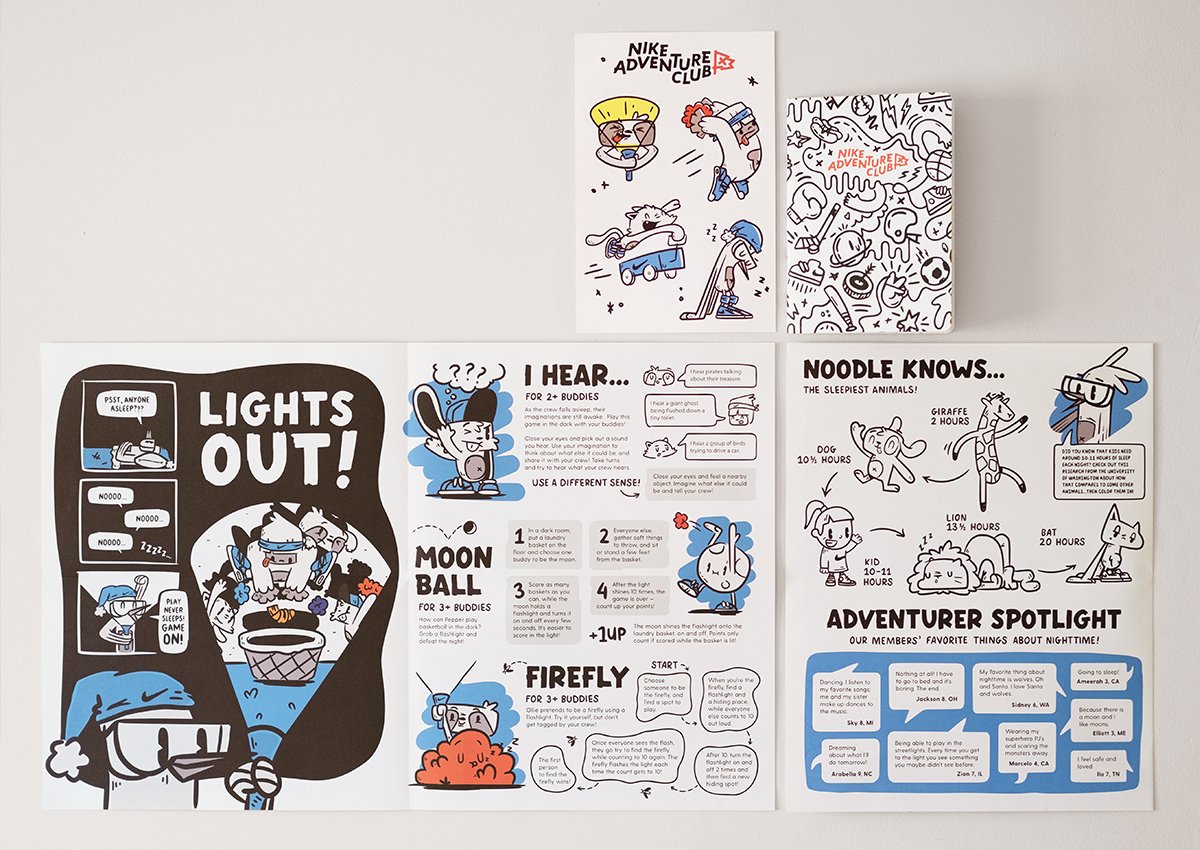
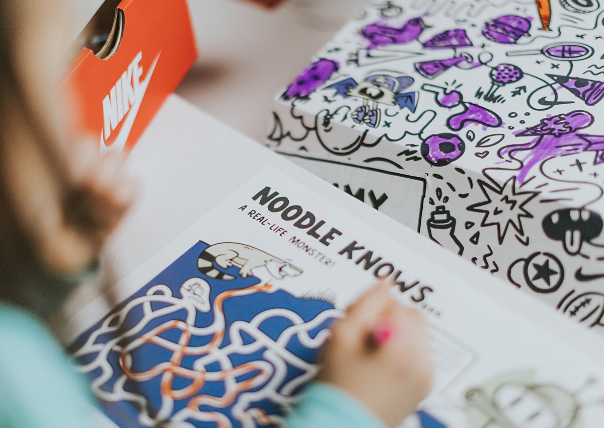
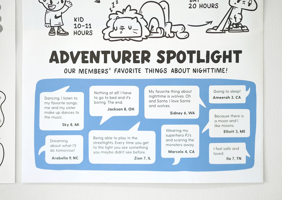
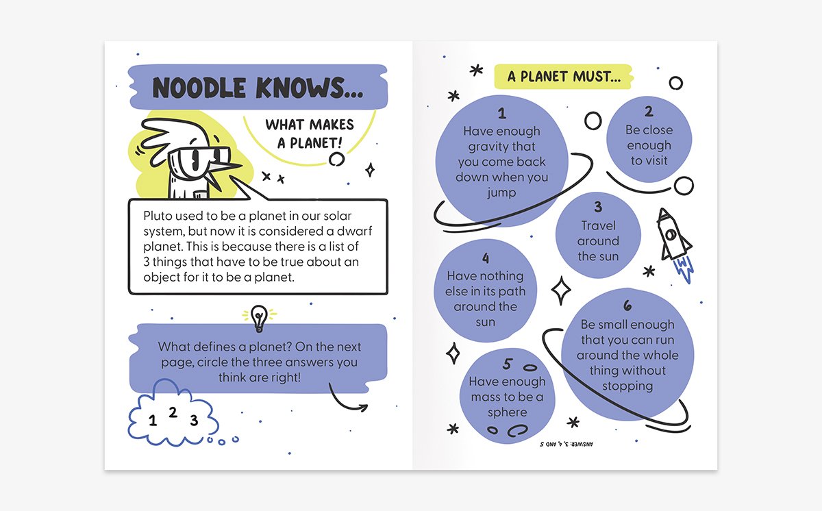
Each section within the guide had its own role: a cover poster to serve as a collectible, a small comic to acquaint members with our cast of characters, a “did you know” section to provide some pen-on-paper interactability, and an Adventurer Spotlight to cultivate a sense of community among members. Each Guide had a different driving theme, but these content sections remained constant.
Research & Pivot
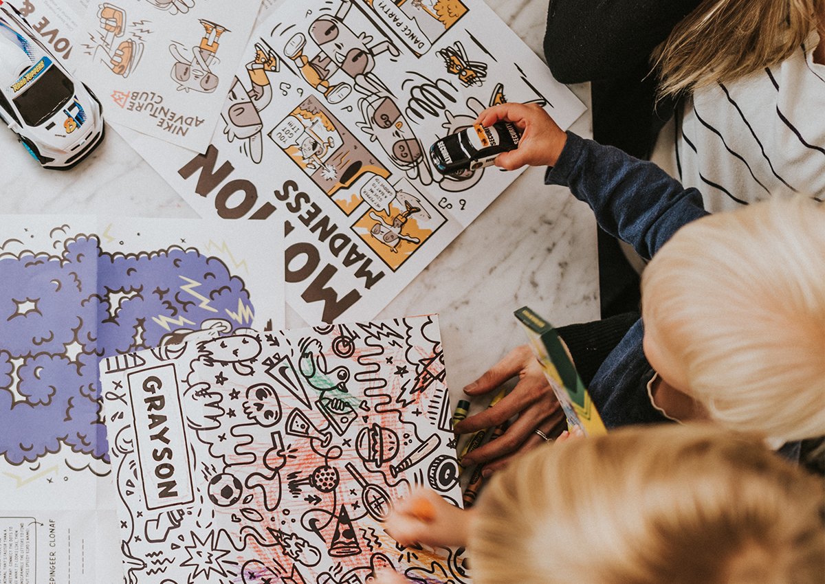
After production of six Guides, we paused to take stock of how they were working for our members. We used a few methods of data collection and assessment: we mined social media feedback and member surveys, conducted ethnography interviews with members, and ran qualitative tests through the platform UserTesting.
One insight from the testing was that our current form factor was too big for young kids, and felt to parents like just a piece of paper that would be thrown away. In response, we began developing a smaller, more portable booklet format.
We also learned that parents and kids both found the most value in the parts of our content that involved pen-to-paper interactivity. Since we were still committed to centering active, physical play, we found ways to weave paper-based activities and reflection prompts into our instructions for physical games. This solution allowed us to be responsive to member needs while staying true to our Nike roots.

My Role
My role in the Adventure Guides was as follows: page layout (from sketches to final execution), typesetting, all hand-lettering and custom fonts, smaller line illustrations (our “doodle style”), all of Noodle Knows, all of Member Spotlight, and print-preparation of guides. I played support roles in the development and execution of the character illustrations, and in the copy and content formulation.
I also contributed to our testing process. I ran, synthesized, and presented results of one of our UserTesting tests, and I played a support role in the conducting and analysis of the other tests.
Separate from the Adventure Guide, but visible in some of these photos: I illustrated the pattern that we use on our box and Adventure Journal (the small, patterned booklet), helped design the box, and designed the inside pages for the Adventure Journal. See my case study on our branding process for a deeper exploration of the NAC brand.
Postscript
The greatest success of the Adventure Guide project was our team’s ability to take feedback, listen, and pivot.
Testing was a crucial part of our process through the whole Nike Adventure Club project. Through ethnography interviews, user testing, and survey and feedback analysis, we were able to get a robust picture of what type of content kids and their grown-ups wanted the most.
Intentional feedback-gathering proved an excellent way to stay laser-focused on the needs of our users. Without that data, it’s easy to design for myself, my peers, or my portfolio; with it, the kids’ needs take center stage and the way forward is clear.
Creative Direction: Chris Arth
Graphic Design and Illustration: Adam Shalz, Kat Black
Copy and Content: Kaleena Newman
Photography: Nash Howe / Brother PDX